Region Settings
Similar to sections, you can use the same arrows per region to change the order at which they are rendered within each of section or move them to another sections.
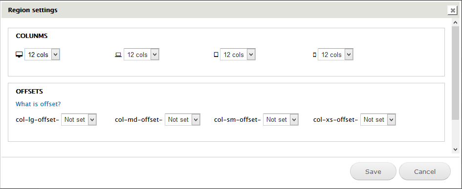
By clicking the gears icon on each region you can set width to each region on different devices.
Based on Twitter Bootstraps 3.x with 12 columns system, you can specify the width of each region. All regions within each section of the theme should add up to 12 cols.
- 6 columns in large device (a haft width of section)
- 6 columns to medium device (a haft width of section)
- 6 columns to small device (a haft width of section)
- 12 columns to very small device section (full width section)
You can also set column offset for the region.