ROW & COLUMN
With the row and column layout shortcodes you can now break down your content into any number of advanced layouts giving variety and hierarchy base on the bootstrap 4 grid. We can create column layout quickly by using shortcode with visual shortcode in block/page builder as below:
Row Shortcode
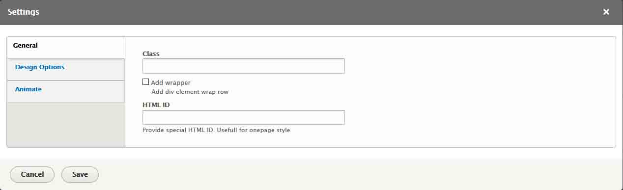 Properties Description:
- Class: Add row class
- Add wrapper: Add wrapper div with custom class
- HTML ID: Add custom class for wrapper html element
Column shortcode
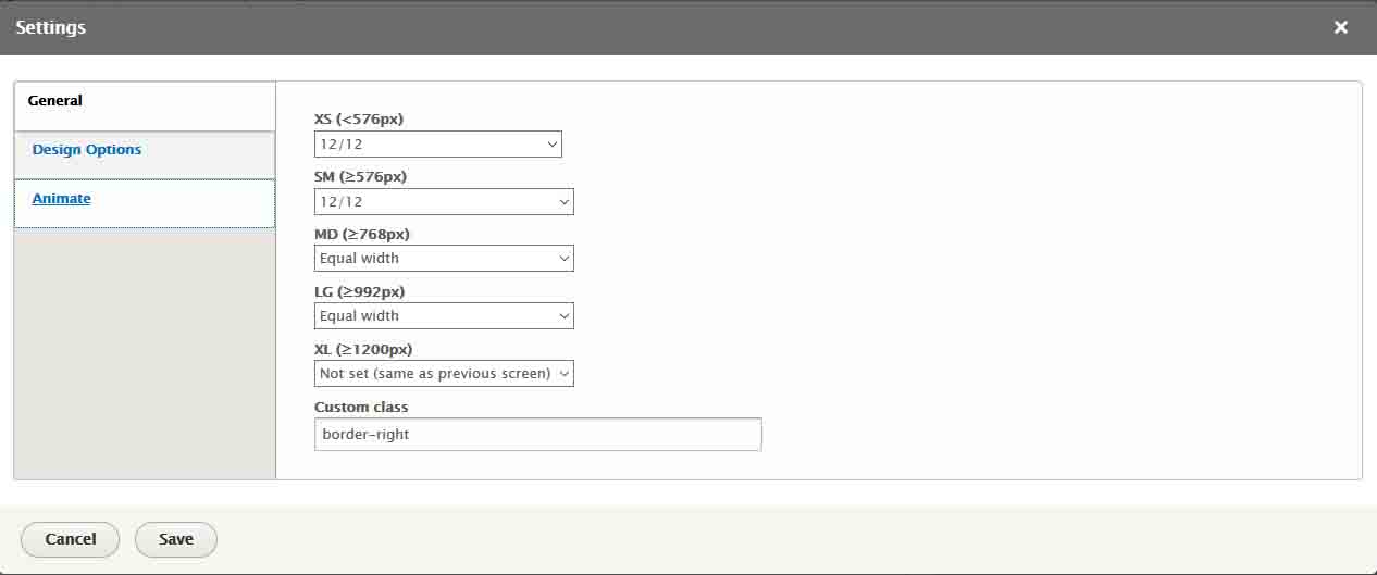 Properties Description:
- XS: Select bootstrap clumn on extra small device (<576px)
- SM: Select bootstrap clumn on small device (Between 576px and 768px)
- MD: Select bootstrap clumn on medium device (Between 768px and 992px)
- LG: Select bootstrap clumn on large device (Between 992px and 1200px)
- XL: Select bootstrap clumn on extra large device (>= 1200px)
- Custom class
You can see more details in this link